Introduction 
Welcome!
Today, we are going to start with preprocessed tag directories in the ~/atac_data/tagdir directory of the meakins-workshop webserver. For preprocessing, we followed the basic guide found at the HOMER suite website.
Here is a summary of the steps we have taken to obtain these directories:
1. Quality control with FastQC. 
Quality control is always important in NGS data processing pipelines! Given a .fastq file (or other file types), FastQC generates a QC report that can identify problems originating in the sequencer or in the starting library material. The output shows several properties of the sequencing reads, such as: sequence quality, GC content, fragment length, etc. Refer to their documentation for more information.
Low quality scores may be caused by transient issues inside the sequencer, such as bubbles in the flow cell. In this case, there is no way to increase quality. However, low quality towards the end of a sequencing read and overrepresented partial adapter sequences may be removed by sequence trimming. See Trimmomatic documentation for more information. Note that this QC step cannot identify all problems with sequenced libraries (especially for ChIP-seq).
2. Mapping reads to the reference genome with STAR aligner. 
The output of aligners such as STAR provide SAM (or the BAM binary equivalent) files. After mapping, always take a look at the generated log files to check the mapping rate and other stats. If the mapping rate is low, the reads may need to be trimmed, or other problems may need troubleshooting.
3. Organizing mapped reads into tag directories with HOMER makeTagDirectory. 
This program organizes mapped and indexed reads by chromosome to speed up downstream processes. The input can be a SAM, BAM, or BED file, and the output is a directory of .tsv files.
The output of makeTagDirectory also provides 4 basic QC analyses:
| File | Information |
|---|---|
| tagInfo.txt | basic tag information (tag count, unique tags, etc.) |
| tagLengthDistribution.txt | histogram of tag lengths |
| tagCountDistribution.txt | “clonal read depth” (number of reads per unique position); can reveal oversequencing—re-run with max tags per bp parameter (set to 1 or 2) to clean up |
| tagAutocorrelation.txt | distribution of distances between adjacent reads in the genome, used to estimate fragment length |
Refer to HOMER Documentation for more information.
Accessing the data 
Let's log in to the webserver and navigate to the directory containing the practice data.
First, open a terminal and enter the following command (ssh = "secure shell" protocol):
ssh meakins-workshop@dinglab.rimuhc.ca
Enter the password meakins when prompted.
Now, enter the following command to activate the command line interpreter (bash = Bourne again shell):
bash
Where are you? Let's see our current working directory using the following command (pwd = "print working directory*):
pwd
What subdirectories are present within this directory? See using the following command (ls = "list"):
ls -al
Finally, navigate to the directory containing the data (cd = "change directory"):
cd atac_data/tagdir
Take a look at the subdirectories by entering tree. You should see the following names:
.
├── KLA_4h_rep1_tagdir
├── KLA_4h_rep2_tagdir
├── Veh_4h_rep1_tagdir
└── Veh_4h_rep2_tagdir
These four directories contain the output of the tool HOMER makeTagDirectory.
Peak calling with HOMER findPeaks 
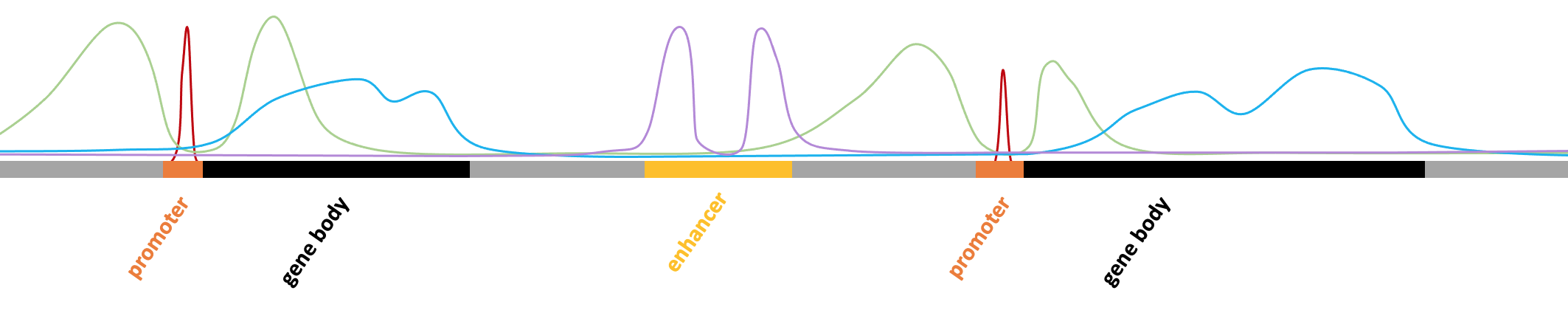
Peak calling identifies genomic regions enriched with sequencing reads. A "peak" is a region where many reads pile up. In the genome browser shot below, the green track ("ATAC Tags") shows piles of reads and the black track above ("ATAC Peaks") shows regions where peaks are called. You may notice that some green "piles" don’t have peaks. This discrepancy is a consequence of peak caller design and input parameters, which can be modified (more below).

The task of peak calling is not so simple. Many peak callers exist, with MACS2 and HOMER findPeaks being the most commonly used. No peak caller is perfect, but these two are highly effective in most cases. We like to use the HOMER suite for most purposes. However, depending on the targeted histone mark, it can be very difficult to call peaks in histone ChIP-seq data due to broad and variable peak sizes. If HOMER findPeaks performs poorly on this type of data, BCP or MUSIC can be tried since they can use multiple window sizes to select candidate peaks.
HOMER findPeaks has 7 modes:
| Mode | Application |
|---|---|
| factor | TF ChIP-seq, ATAC-seq |
| histone | histone mark ChIP-seq |
| super | super-enhancer identification |
| groseq | GRO-seq |
| tss | 5’RNA-seq/CAGE, 5’GRO-seq |
| dnase | DNase-seq |
| mC | DNA methylation |
In addition to choosing a mode, other parameters should be chosen with regard to the experiment.
For ATAC-seq or TF ChIP-seq experiments (eg. red peaks below), peaks are sharp with narrow boundaries and are found in open promoters and enhancers. Thus, consider the following when running findPeaks:
- Allowing use of the esimated peak size from autocorrelation analysis
- Setting a fixed peak size in the range of 200-400bp if the estimated size is off
For Histone ChIP-seq experiments (eg. blue, purple, and green peaks below), peaks have variable shapes covering broad regions (depending on the role of the histone mark in question), and they can be found anywhere in the genome. Thus, consider the following when running findPeaks:
- Running findPeaks with the “region” option to disable local filtering and stitch together enriched peaks
- Setting the “building block” peak size in the range of 500-2000bp
- Setting the minimum distance between peaks to 1000bp or 2x the peak size
- Not centering peaks at positions with highest tag density
- Running with several different parameters to determine the optimal parameters for the histone mark in question
For more information, see HOMER documentation.
Let's run the peak finder!
First, create your own directory in ~/students (if you haven't already done so) and navigate there (mkdir = "make directory"):
mkdir ~/students/<your_name>

cd ~/students/<your_name>
Take a look at all the options for running the peak caller:
findPeaks
There are many ways! It's very important to consider the options when doing your analysis. Today, we'll simply run findPeaks with a KLA experiment and Veh control as "background" to get differential peaks between the two conditions. We'll also use -style factor to specify that our ATAC peaks are sharp and narrow:
findPeaks ~/atac_data/tagdir/KLA_4h_rep1_tagdir -i ~/atac_data/tagdir/Veh_4h_rep1_tagdir -style factor > diff_peaks.txt
Let's take a look inside this peak file (less is a scrollable view of a file):
less diff_peaks.txt
Type q to quit this view. Before we move on, we'll need to generate a peak file without the first 39 header lines for downstream analysis (sed = "stream editor", ):
sed -e '1,39d' diff_peaks.txt > diff_peaks_nohead.txt
Aside: sed (and many other commands) are very useful! At any time, if you want to see the manual for a command line tool, you can simply type man <command> (eg. man sed, in this case). Exit the manual using q.
We're ready to annotate these peaks!
Annotating peak files 
The HOMER suite has many pre-written programs you can use to explore and analyze data. Since basic peak files lack gene annotations, let's add them by running the annotatePeaks.pl program. But first, we should mention some important information about this process...
Annotation simply assigns labels to peaks based on nearby genes. For each peak, it determines the distance to the nearest transcription start site (TSS) and assigns the peak to that gene (see red arrows below). Detailed infromation is also added, indicating the type of genomic region occupied by the center of the peak.

Although annotation can be very useful, there are drawbacks to keep in mind. For instance, annotation of enhancer regions can be problematic since they can act on genes very far away (see dashed gray arrow above). To improve annotation, you can restrict the program to genes expressed in RNA-seq data. If RNA-seq data is unavailable, you can filter the annotation results to only include peaks within a promoter region, or within a specified distance from a TSS. In today's basic analysis, we'll filter peak annotations by setting a maximum distance threshold to a TSS. For more information, take a look at HOMER annotation documentation.
First, take a look at command line options for annotatePeaks.pl:
annotatePeaks.pl
Now, run the program on one of the peak files (KLA):
annotatePeaks.pl diff_peaks.txt mm10 > diff_peaks_ann.txt
This will take a minute (or more)... When it's finished, take a quick look at the output:
less diff_peaks_ann.txt
Repeat this process using tag directories as well, so we can obtain tag counts at each differential peak:
annotatePeaks.pl diff_peaks.txt mm10 -d ~/atac_data/tagdir/Veh_4h_rep1_tagdir ~/atac_data/tagdir/KLA_4h_rep1_tagdir > diff_peaks_ann_counts.txtFiltering the data 
Now that we have annotated peaks from each sample, we can examine and filter the data using some basic python libraries. We've also prepared a simple module with functions you can use for your analysis (feel free to browse this file if you are interested). Copy it to your own directory using the following command:
cp ~/atac_data/functions.py ~/students/<your_name>
Now, you are ready to open a jupyter notebook linked to the server by typing the following command:
conda activate workshop

jupyter lab --no-browser
The output will look something like this:
[I 2022-08-09 21:15:11.864 ServerApp] jupyterlab | extension was successfully linked.
[I 2022-08-09 21:15:11.877 ServerApp] nbclassic | extension was successfully linked.
[I 2022-08-09 21:15:12.114 ServerApp] notebook_shim | extension was successfully linked.
[I 2022-08-09 21:15:12.143 ServerApp] notebook_shim | extension was successfully loaded.
[I 2022-08-09 21:15:12.144 LabApp] JupyterLab extension loaded from /home/meakins-workshop/anaconda3/envs/workshop/lib/python3.10/site-packages/jupyterlab
[I 2022-08-09 21:15:12.145 LabApp] JupyterLab application directory is /home/meakins-workshop/anaconda3/envs/workshop/share/jupyter/lab
[I 2022-08-09 21:15:12.149 ServerApp] jupyterlab | extension was successfully loaded.
[I 2022-08-09 21:15:12.193 ServerApp] nbclassic | extension was successfully loaded.
[I 2022-08-09 21:15:12.193 ServerApp] The port 8888 is already in use, trying another port.
[I 2022-08-09 21:15:12.194 ServerApp] Serving notebooks from local directory: /home/meakins-workshop
[I 2022-08-09 21:15:12.194 ServerApp] Jupyter Server 1.18.1 is running at:
[I 2022-08-09 21:15:12.194 ServerApp] http://localhost:8889/lab
[I 2022-08-09 21:15:12.194 ServerApp]  or http://<your_IP_address>:8889/lab
[I 2022-08-09 21:15:12.194 ServerApp] Use Control-C to stop this server and shut down all kernels (twice to skip confirmation).
Now, copy the unique 4-digit port number given in the third-last line of the output (in the URL http://localhost:<your_port_number>/lab). You will need to use this number to access jupyter on the webserver.
Open a second terminal window and log in again, using your unique port number and some extra flags this time:
ssh -N -L <your_port_number>:localhost:<your_port_number> meakins-workshop@dinglab.rimuhc.ca
For the example above, <your_port_number> would be replaced with 8889:
ssh -N -L 8892:localhost:8892 meakins-workshop@dinglab.rimuhc.ca
Enter the password meakins when prompted. This time, your terminal will appear not to have responded. Don't worry about this, just minimize the window and go back to the first terminal.
Copy the full url given in the second-last line of the output and paste it into a new internet browser window. You will be prompted for the password again.
Now you should see the jupyter lab layout, with files listed on the left panel. Navigate to your own directory and open a new notebook. Type the following python code to begin the filtering process.
# import the basic python libraries
import numpy as np
import pandas as pd

# import our functions module
from functions import functions as fn
# read the data
data = pd.read_csv('diff_peaks_ann_counts.txt', sep = '\t')

# print the number of rows in the dataframe (corresponds to the number of peaks)
print(len(data))
We have a lot of peaks! Many of these were called with lower confidence, and/or their annotations may be too far to be realistic. To narrow down the number of peaks to deal with, let's filter by Peak Score and Distance to Nearest TSS.
But first, let's take a look at the distribution of peak scores. We'll use the peak_score_dist() function in the functions module. If you want to see the python code underneath, open the functions.py file and search for the function name.
# plot the distribution of peak scores
fn.peak_score_dist(data)

Notice the contrast between the frequency of very low and very high peak scores. The largest score probably comes from a very large (wide and tall) peak. Perhaps a super enhancer?
Let's get rid of peaks with very low scores.
# filter to a min peak score
data = fn.filter_by_peak_score(data, 4)

# print the number of peaks left after filtering
print(len(data))
Notice how many peaks were removed in this filtering step! You can play around with various thresholds here...
Let's take a look at the distribution of the filtered peak scores.
# plot the distribution of peak scores
fn.peak_score_dist(data)

Next, let's filter by distance to nearest TSS.
# filter to a max distance to the nearest TSS of 10kb and print the number of peaks
data = fn.filter_by_tss_dist(data, 10000)
print(len(data))
# plot the distribution of peak scores
fn.peak_score_dist(data)

We've reduced the number of peaks dramatically! Notice how the very large peak was removed in the filtering step by distance to TSS.
FYI: some genes appear multiple times in the dataframe. This makes sense, as it is possible to have multiple peaks in proximity of a gene. However, it can complicate things when analyzing peak data.
Also note that it is best practice to use unique gene IDs (such as Ensembl IDs) when processing data, rather than gene symbols.
data['Gene Name'].value_counts()
Visualizing the data 
Scatter plots
Let's visualize the results of peak finding and the differential peak analysis.
# read the peak file containing tag count information for differential peaks
diffpeaks = pd.read_csv('diff_peaks_nohead.txt', sep = '\t')
# plot p-value vs. fold change
fn.plot_volcano(diffpeaks)

Note that in the plot above, red points represent p-values of 0. It is quite uncommon to see a p-value of exactly zero. In this case, we simply do not have enough resolution (decimal places) to calculate very small p-values, so these are rounded down to 0. Since the logarithm of 0 is undefined, this action throws a "divide by zero" error.
# read the peak file containing annotations for peaks
peaks = pd.read_csv('diff_peaks_ann_counts.txt', sep = '\t')
# plot tag counts in two experiments vs each other
fn.tags_vs_tags(peaks)

Heatmap for genes of interest
Suppose we're interested in a particular gene set such as the Toll-like receptor signaling KEGG pathway (mmu04620). We have prepared a file containing the gene names in this pathway for this demo: ~/atac_data/KEGG_mmu04620.txt
Let's take a look at the filtered ATAC peaks by plotting a heatmap of the peaks found near these genes of interest.
# read the list of genes from the gene set file
geneset = np.loadtxt('/home/meakins-workshop/atac_data/KEGG_mmu04620.txt', dtype = str).tolist()
print('There are {} genes in the gene set'.format(len(geneset)))

# subset the filtered dataset to the genes in the gene set
keep = [ i in geneset for i in data['Gene Name'] ]
subset = data[keep]

# plot the peaks annotated to genes in the gene set
fn.plot_heatmap(subset)

Although there are 85 genes in the gene set file, not all of them have peaks near their TSS. Alternatively, if peaks near those genes were even closer to other genes, they were assigned other annotations. Keep this in mind! The heatmap displays only few genes (depending on the filtering thresholds set above), and some genes appear multiple times since a gene may also have several peaks nearby.
Gene set enrichment analysis 
Now, suppose we want to calculate enrichment of this gene set in our ATAC peaks. Let's perform a basic Fisher's exact test to get an enrichment p-value for the Toll-like receptor signaling KEGG pathway.
# get a list of genes from significant differential peaks in the data
sig_genes = data['Gene Name'].dropna().to_list()
sig_genes_unique = list(set(sig_genes))
print('There are {} unique genes with significant differential peaks in the filtered data'.format(len(sig_genes_unique)))

# Fisher's exact test for the gene set
pval = fn.fisher_exact_test(sig_genes_unique, geneset)
print('The enrichment p-value for the Toll-like receptor signaling pathway is {}'.format(pval))
# save the list of genes to a text file
np.savetxt('genes_for_gsea.txt', sig_genes_unique, fmt = '%s')
You can download this file to your computer using the command below. You'll need to open a new terminal window for this:
scp meakins-workshop@dinglab.rimuhc.ca:/home/meakins-workshop/students/<your_name>/genes_for_gsea.txt <path_to_local_directory>
Now you can navigate to your gene set enrichment tool of choice and upload this text file for analysis!
Principal component analysis 
Principal component analysis (PCA) is a dimensionality reduction method. Dimensionality reduction is the projection of high-dimensional data into a low-dimensional space. PCA creates new features called principal components (PC) from linear combinations of the original features such that the variance in the data is maximized along each PC. PCs are ordered by decreasing proportion of variance explained, so the first two PCs are typically chosen to graphically represent high-dimensional data.
A dataset with many features (such as genes) can be represented in two dimensions by combining information from the original features. The resulting PCs are not easily interpretable because they do not represent concrete “real-world” measures, but they can be useful for visualizing high-dimensional data.

It should be noted that PCA performs poorly under certain conditions, such as when the number of features or observations is very high. It is also highly sensitive to outliers and is unable to capture nonlinear structure in the data. Other dimensionality reduction methods such as t-SNE and UMAP make up for these limitations, but they are more complicated in other ways.
Start by importing the some python libraries:
from sklearn.preprocessing import StandardScaler
from sklearn.decomposition import PCA
import matplotlib.pyplot as plt
The most important thing to do before performing a PCA is scaling the data to a standard normal distribution (mean 0 and standard deviation 1). We'll do this using the StandardScaler():
scaler = StandardScaler()
Now we can use the above StandardScaler object to fit and transform the last 2 columns of the data (these columns contain tag count information for peaks in the two experiments).
Note that the data need to be transposed first (using .T), such that the observations (experiments) become rows and the features (peaks) become columns.
scaled_data = scaler.fit_transform(data.iloc[:,-2:].T)
Important note: scaling (and performing a PCA) doesn't make sense for only two samples (data points). We'll demonstrate a PCA using only these 2 for now, just so you see how it can be done.
# create a PCA object and specify that we want 2 PCs
pca = PCA(n_components = 2)

# fit and transform the scaled data
pca.fit(scaled_data)
X = pca.transform(scaled_data)

# extract the important information from the transformed data
pc_df = pd.DataFrame(X)
pc_1, pc_2 = pca.explained_variance_ratio_
# create a figure with an axis object within it
fig, ax = plt.subplots(figsize = (3, 3))

# plot the two columns of the PC dataframe in a scatterplot
ax.scatter(x = pc_df.iloc[:,0], y = pc_df.iloc[:,1], s = 10, color = 'teal')

# display the % of explained variance on each axis label
ax.set_xlabel('PC 1 ({}% of variance)'.format(round(pc_1*100, 2)))
ax.set_ylabel('PC 2 ({}% of variance)'.format(round(pc_2*100, 2)))

# save the figure as a .pdf file in the current directory
fig.savefig('./pca_fig.pdf', bbox_inches = 'tight')

Again, note that doing a PCA for only 2 samples doesn't make sense... the first PC automatically explains 100% of the variance between the two data points.
Motif analysis 
Motif finding experiments typically use TF ChIP-seq or ATAC-seq peaks to identify potentially relevant TF binding sites. In this case, a motif represents a short (6-14bp) DNA sequence that is bound by a TF.

See HOMER motif analysis documentation for more information.
To run the basic form of HOMER known motif analysis within the differential peak regions, use the following command:
mkdir ~/students/<your_name>/motifs

findMotifsGenome.pl diff_peaks.txt mm10 ~/students/<your_name>/motifs -size given -nomotif
It's going to take a while...
The output of motif analysis will look something like this:

You can download the results using the following command in a new (local) terminal:
scp meakins-workshop@dinglab.rimuhc.ca:/home/meakins-workshop/students/<your_name>/motifs/knownResults.html <path_to_local_directory>Written by Orsolya Lapohos